After the Click: Give Your Confirmation Screen Something to Say
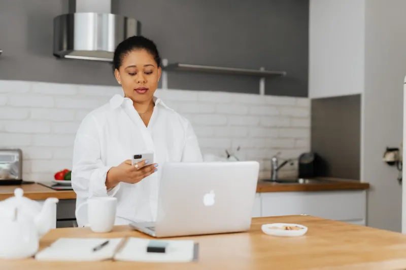
The moment after the click is oddly under-written. A visitor has just handed over an email address, a card number, or both. They're not browsing any more. They're waiting. And what most brands give them is a grey box that says "Thank you for your submission" and a reference number with no explanation.
That's a wasted opportunity, and it's one of the cheapest to fix.
Everyone remembers the landing page. Nobody briefs the receipt.
Marketing teams agonise over the homepage. They A/B test the hero. They rewrite the button copy six times. Then the thank-you page gets knocked together by whoever built the form, usually at 4:50pm on a Friday, with placeholder text that somehow survives to launch.
Which is a shame, because this is the one page where your reader is guaranteed to be paying attention. They've committed. They want to know what happens next. That makes it prime editorial space — more captive than a blog post, more focused than a newsletter.
Tell them what's actually going to happen
The single most useful thing a confirmation screen can do is answer the question forming in the reader's head: "and then what?"
Not "your order has been received" — that's a status, not an answer. Try: "You'll get an email from us within ten minutes. If it's not there by lunchtime, check your junk folder, then give us a ring on the number below."
For a UK shop, the specifics matter more than the sentiment. Which courier? Royal Mail Tracked 48 or Evri? When does it dispatch — today if ordered before 2pm, or the next working day? Is Saturday a working day for you or not? Do you deliver to the Highlands and Islands, and if so, does the estimate change?
A sentence that says "Standard delivery is 2–3 working days via Royal Mail, and you'll get a tracking link when it leaves our warehouse in Leeds" does more for trust than a paragraph about how much you value every customer.
Receipts, VAT and the boring bits done well
If someone's buying on behalf of a business, they need a VAT invoice, and they need to know they're getting one. Say so: "A VAT receipt will be attached to your confirmation email — if your finance team needs it addressed differently, reply to that email and we'll reissue it."
Similarly, if there's a cancellation right, spell it out in human language. "Changed your mind? You've got 14 days from delivery to send it back, unused, and we'll refund the full amount including standard postage." That's clearer than a link to clause 9.4, and it pre-empts the email someone would otherwise send to your support inbox.
The cheapest support-ticket reduction you'll ever write
Most inbound queries after a purchase are not complaints. They're anxieties: did it go through, when will it arrive, can I change the address, will I get a receipt. A confirmation page that answers those three or four questions in advance will quietly cut your inbox.
Add a short "what happens next" list. Add a "need to change something?" line with a real email address and a realistic response time — "we reply within one working day" beats "we'll be in touch shortly" every time. And please, put the order number somewhere obvious and copyable, not buried in 11px grey text.
Don't switch off your personality at the finish line
The thank-you page is where brand voice tends to evaporate. The homepage is chatty; the confirmation screen reads like a parking ticket. Readers notice the gear change, even if they couldn't name it.
You don't need jokes. You need consistency. If your brand is warm, be warm: "Nice one — your order's with us and we're already picking it." If your brand is dry and efficient, stay dry: "Order confirmed. Dispatch details below." The point is that it should sound like the same company that sold them the thing thirty seconds ago.
Three quick checks before you publish
First, read it aloud. If you stumble, rewrite it. Confirmation copy gets skimmed at speed, so short sentences win.
Second, check the tense. "Your order has been dispatched" and "your order will be dispatched" are very different promises, and mixing them up is how you get angry emails on a Tuesday morning.
Third, make sure the next step is obvious. If the reader's only job now is to wait, say so kindly. If they need to do something — confirm an email address, book a slot, download a file — put that instruction above everything else, ideally with a single clear button.
The small page with the long tail
Nobody puts a thank-you page on the brand guidelines deck. But it's the page that gets screenshotted, forwarded to a finance department, and read twice — once in excitement, once in mild worry. Give it a proper sentence or two, and it will pay you back in fewer queries, calmer customers, and a brand that feels like it was paying attention all along.